
Where Flavour Begins
Branding - Animation - Marketing
Client: Bright
A brand created from the ground up for one of Latin America’s most iconic comfort foods: empanadas. Inspired by the client’s heritage, the identity brings together the warmth of traditional empanadas with the bold flavors of Peruvian cuisine. The project included brand strategy, a comprehensive visual identity, brand guidelines, and social media design.
Brand strategy & Positioning:
Together with the marketing team, we explored the Peruvian comfort food market to understand its audience, communication style, and opportunities for the brand.

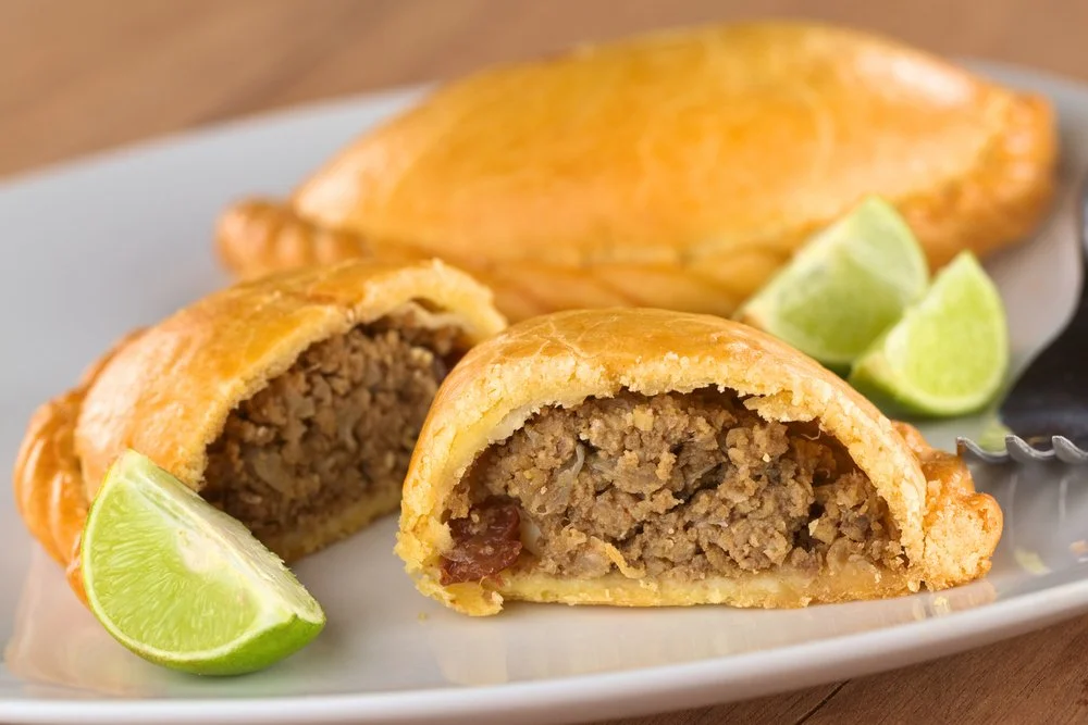
We defined a playful and approachable personality aimed at a younger audience. Celebrating what makes a great empanada: generous fillings, bold flavors, and that satisfying first bite.
Visual Identity & Brand Guidelines:
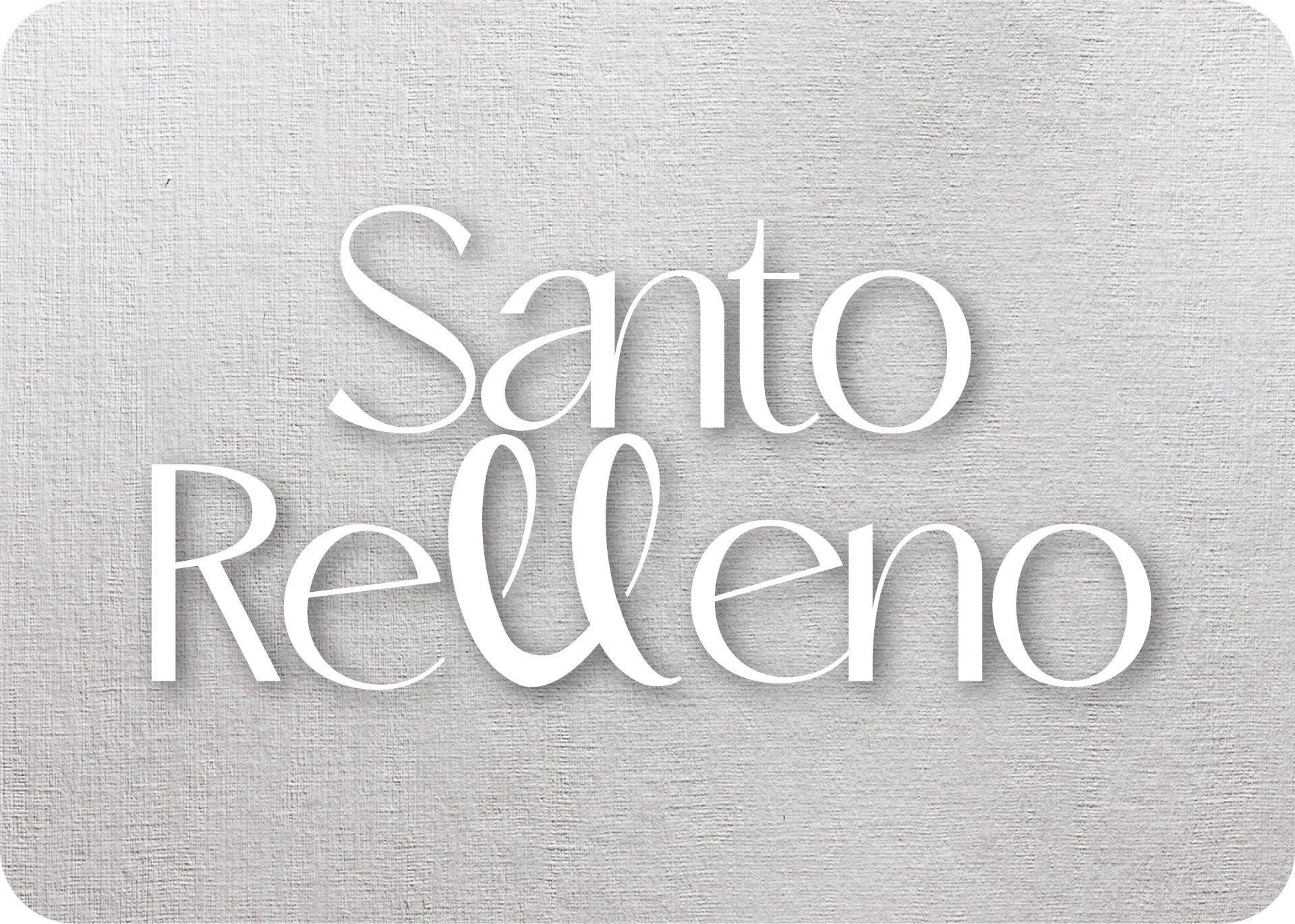
The identity is built around an organic typeface, with the double “L” in the logo emphasized as a visual expression of that peak moment of satisfaction.
The color palette takes inspiration from the ingredients of an empanada: cream for the dough, blue for seasonings, red for the filling, and green for lime.
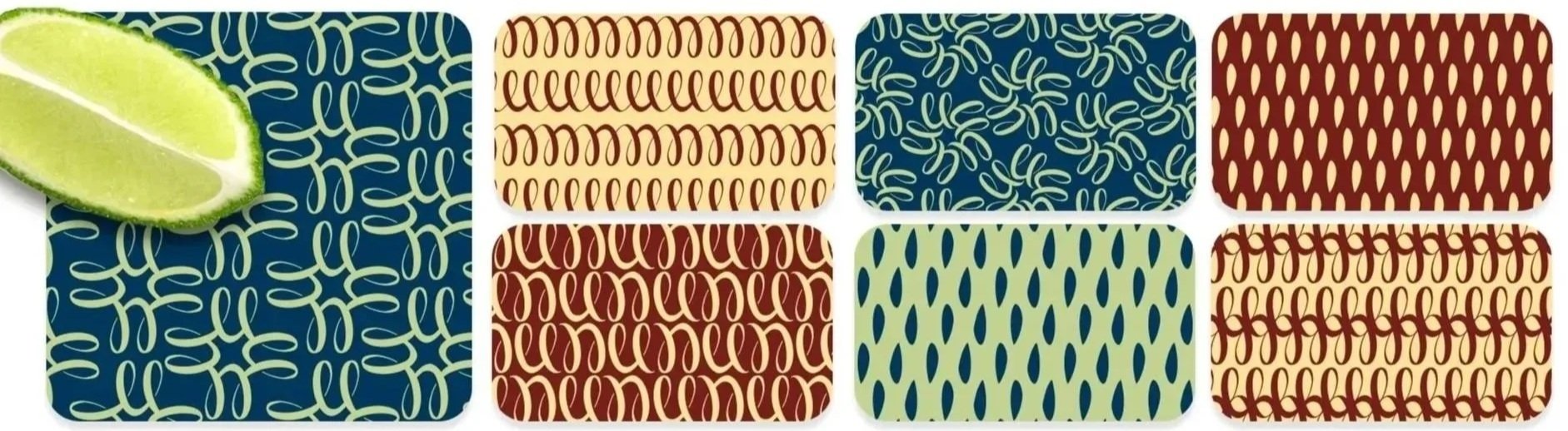
Patterns derived from the double “L” extend the identity into a flexible graphic system.
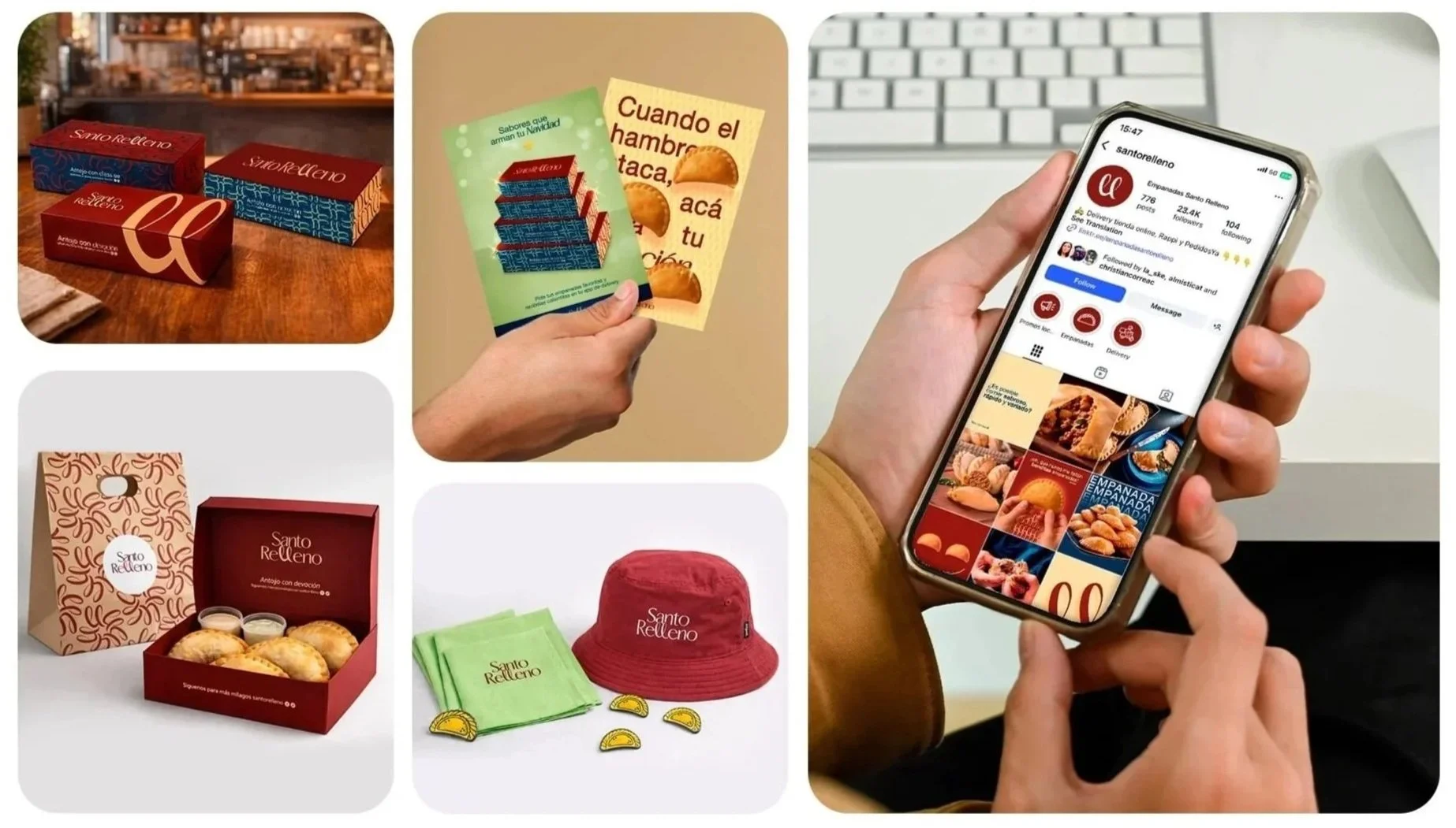
Result:
A youthful, friendly brand that speaks like a friend and understands what Peruvian food lovers look for: generous portions, bold flavors, and plenty of sazón.