OOH Campaign
Visual Design - Art Direction
Client: Word Forest
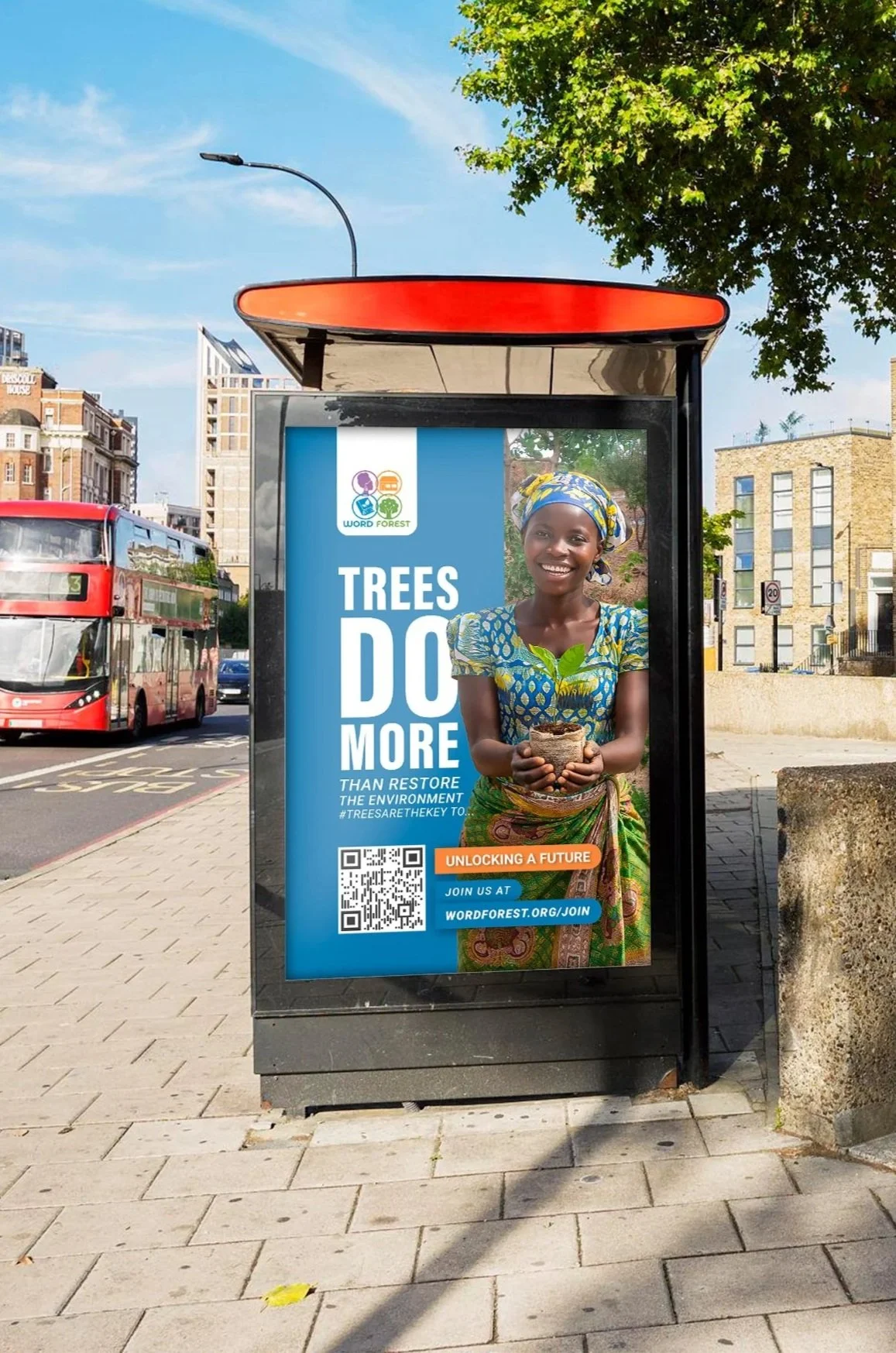
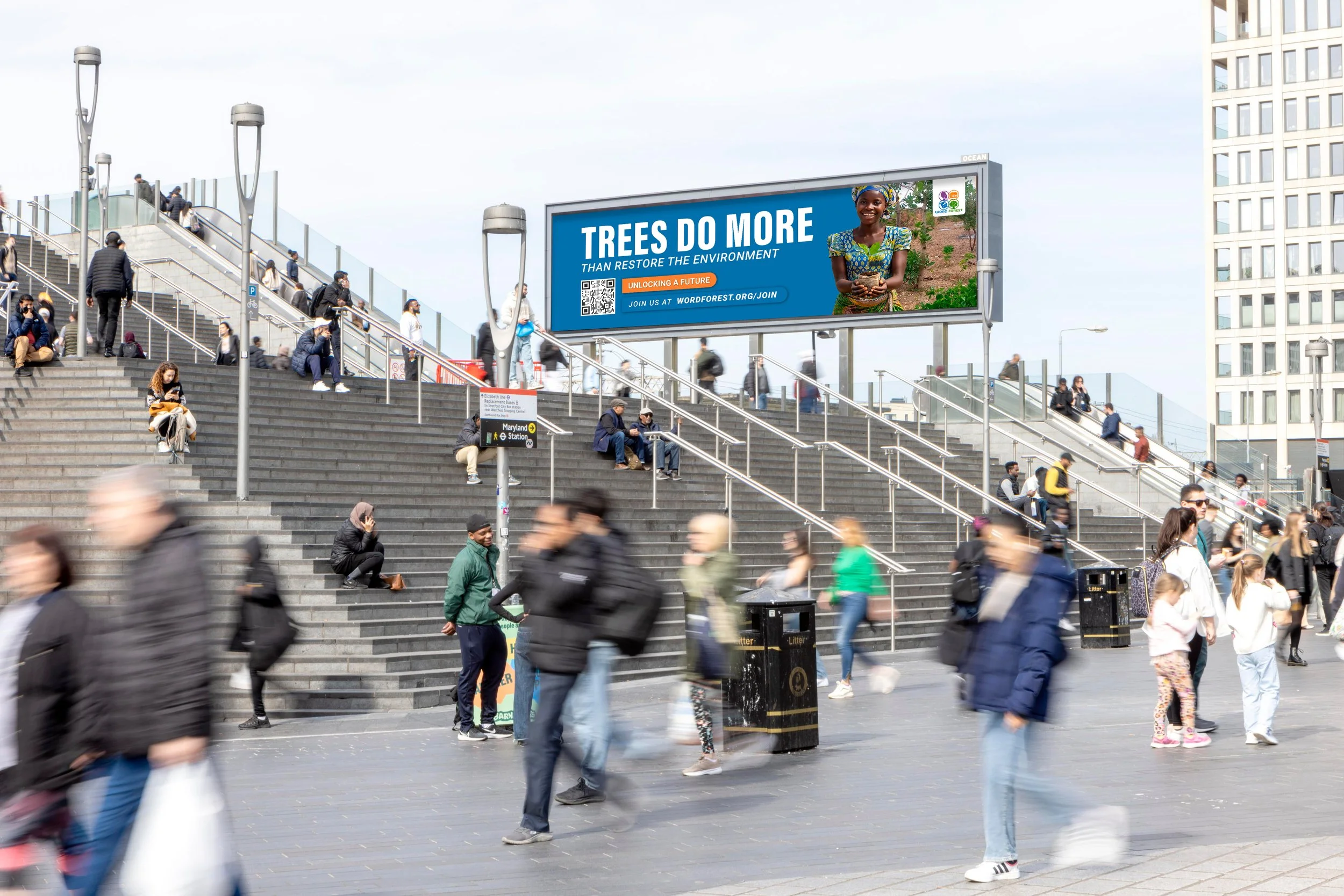
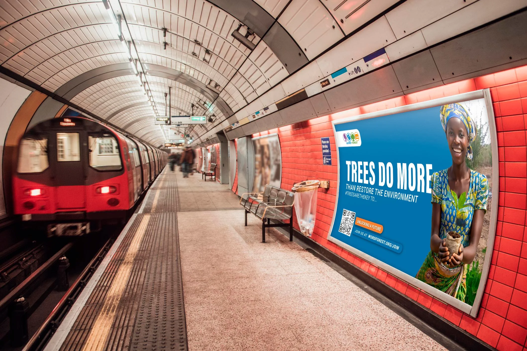
"Trees do more" was a campaign developed in the UK to raise awareness of the transformative impact of tree planting, showing how a simple action can make a meaningful difference for both the environment and society.
Concept Development:
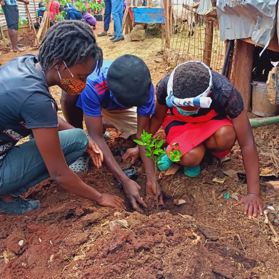
Through brainstorming sessions with the team, we explored different creative directions and landed on “Trees Do More”, a concept highlighting the essential role trees play in protecting our environment.
Visual Direction:
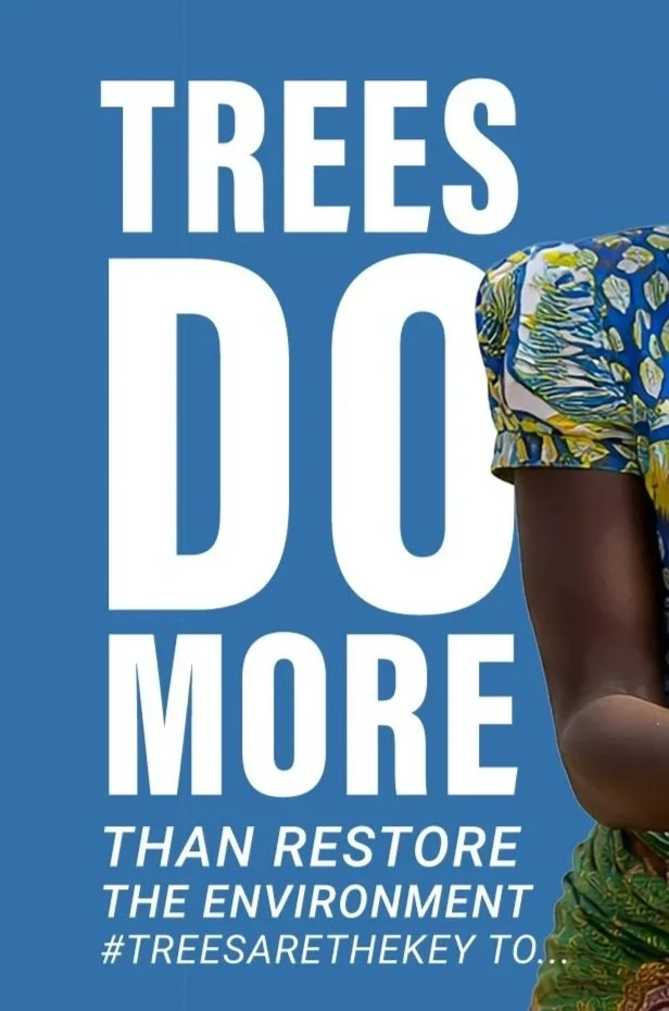
Inspired by the brand’s identity, we created a modern and youthful visual direction while keeping its core elements: recognizable colors and clean typography.
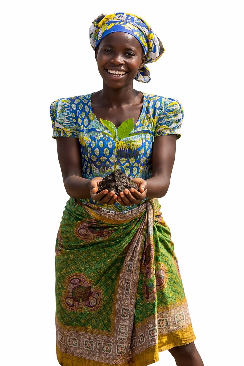
A woman holding a growing tree represents environmental protection from the very beginning. Her joyful expression adds warmth, while her traditional clothing highlights the communities supported through reforestation.
Outcome:
A cohesive visual system brought to life through modern animation, creating a fresh and engaging campaign while staying true to the brand.